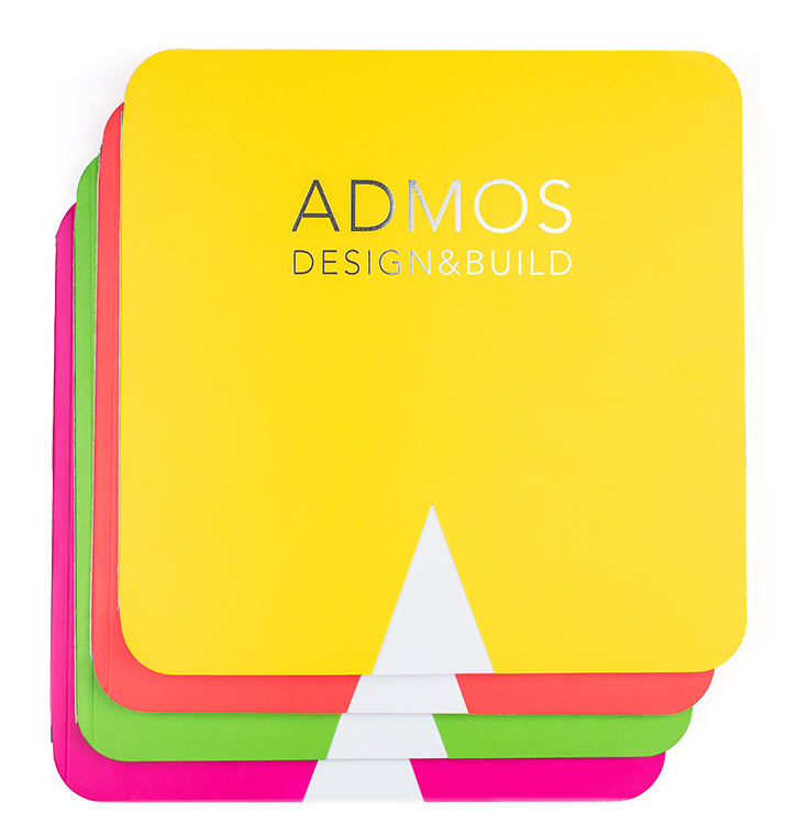
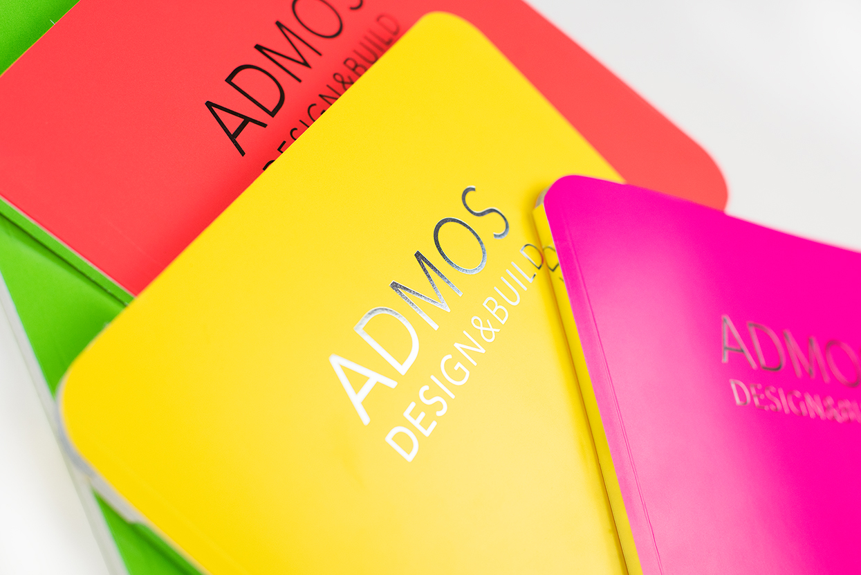
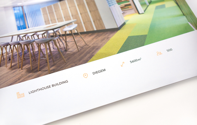
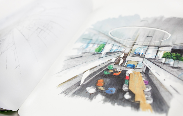
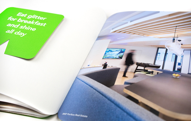
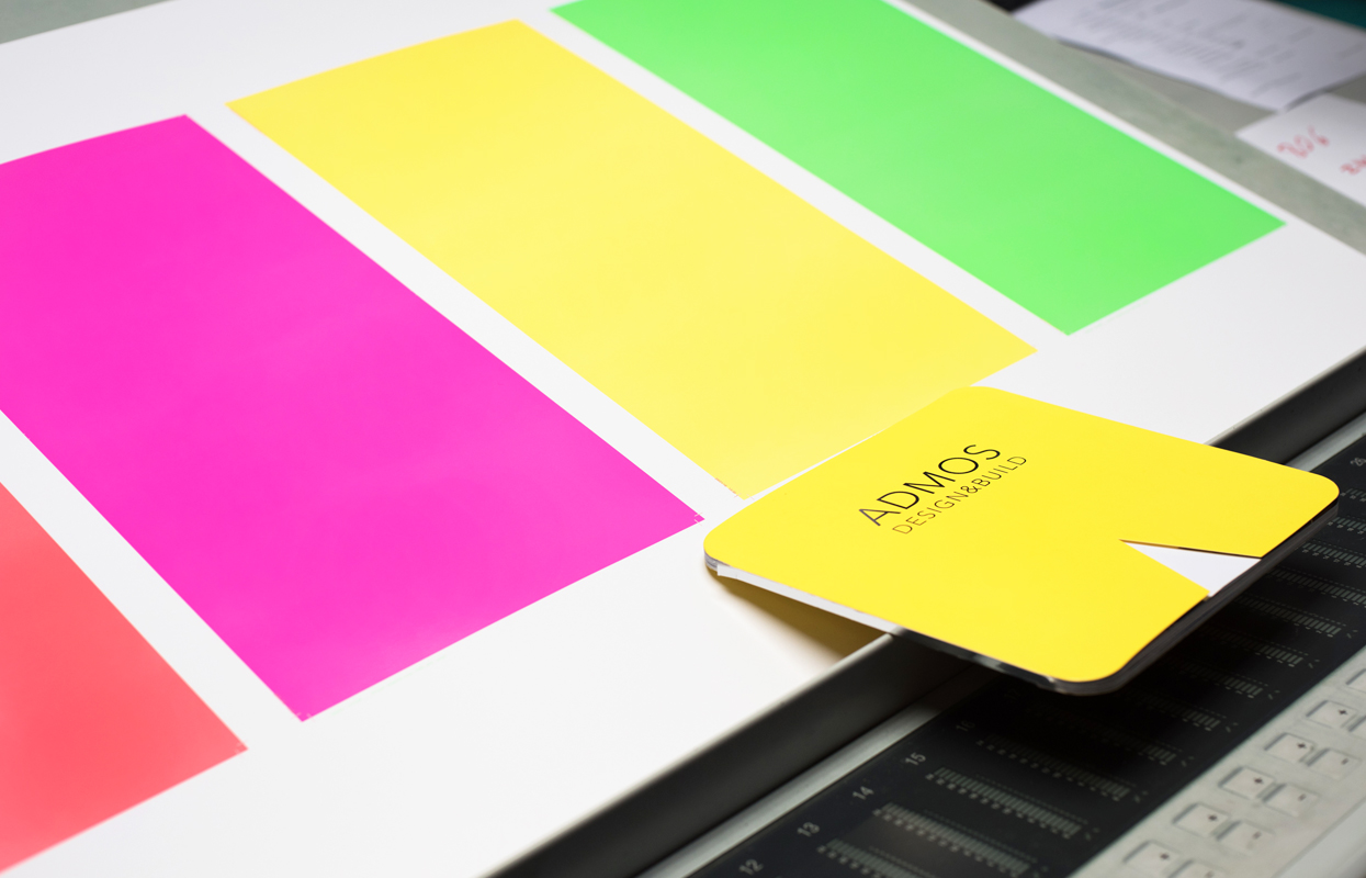
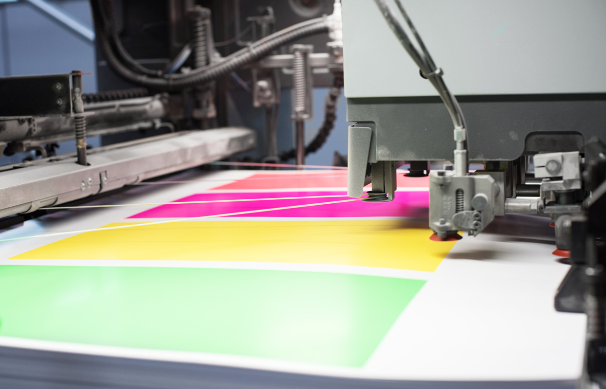
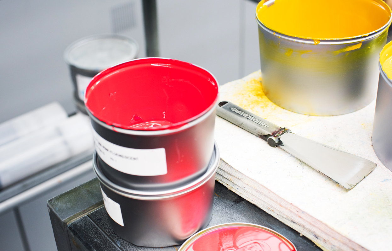
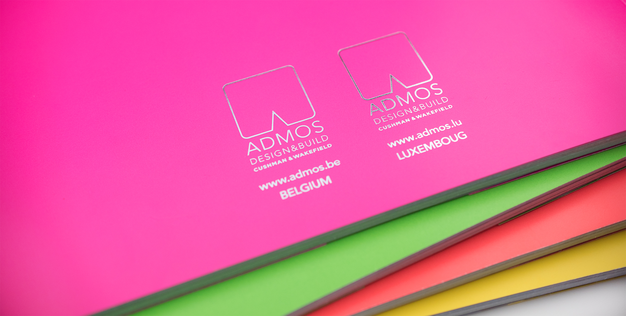
We were please, once again to work on the ADMOS brochure - recently bought by Cushman & Wakefield. Victoria Agency designed their previous brochure, as-well as their logo & nice electric identity. This new brochure will collect their latest & famous projects. It is a real working & prospecting tool! Admos (now C&W) is a very famous company with brilliants & creative ideas to “build shapes & spaces”. We had the strong will to communicate this concept creatively within the brochure. Electric colors were already part of their identity, but we wanted to make it even more striking! For that, we have created a very unique & eyes catchy cover: laser cut in ADMOS logo shape in a fluorescent orange, pink, green & yellow perfected with a hot foil touch. The idea was to offer ADMOS the possibility to choose the brochure colour according to their prospect - a nice personalised touch. For the inside of the brochure, we mixed different type of paper, to remind all the different texture they also use in their architectural / design project. Sublime drawing textured paper, tracing paper with handmade sketches or detachable cards with inspirative quotes. Each project is build with a big great big photography & all the basics infos: building, location, m2 space & number of employee. The printing process of this brochure was a real mission that I was happy to follow. The main dilemma was about the cutting of the cover with rounded edges… but mission completed! I love printer & I was a happy child doing a photo reportage you can see below.

© 2024 Copyright Olivia D Design by Olivia Delsart