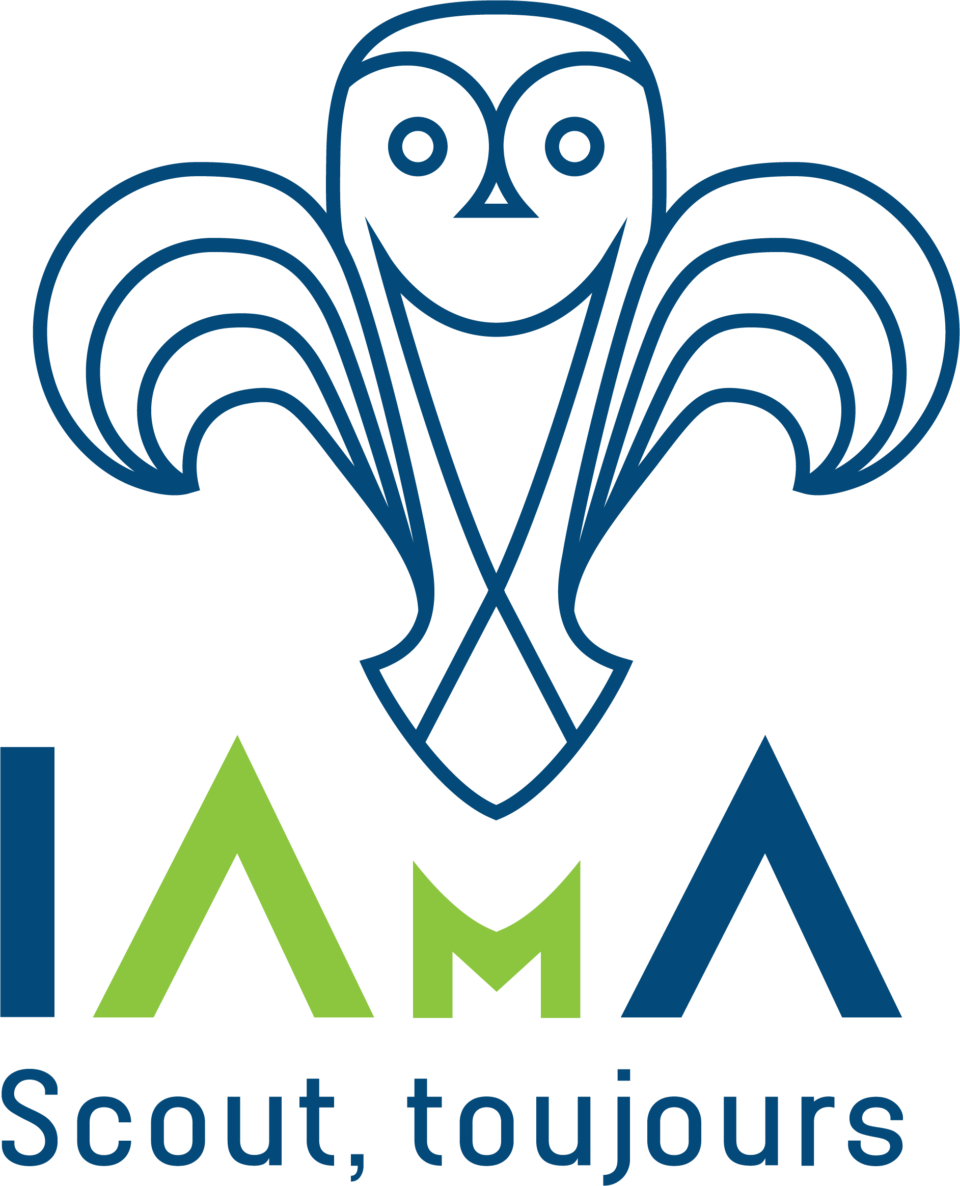
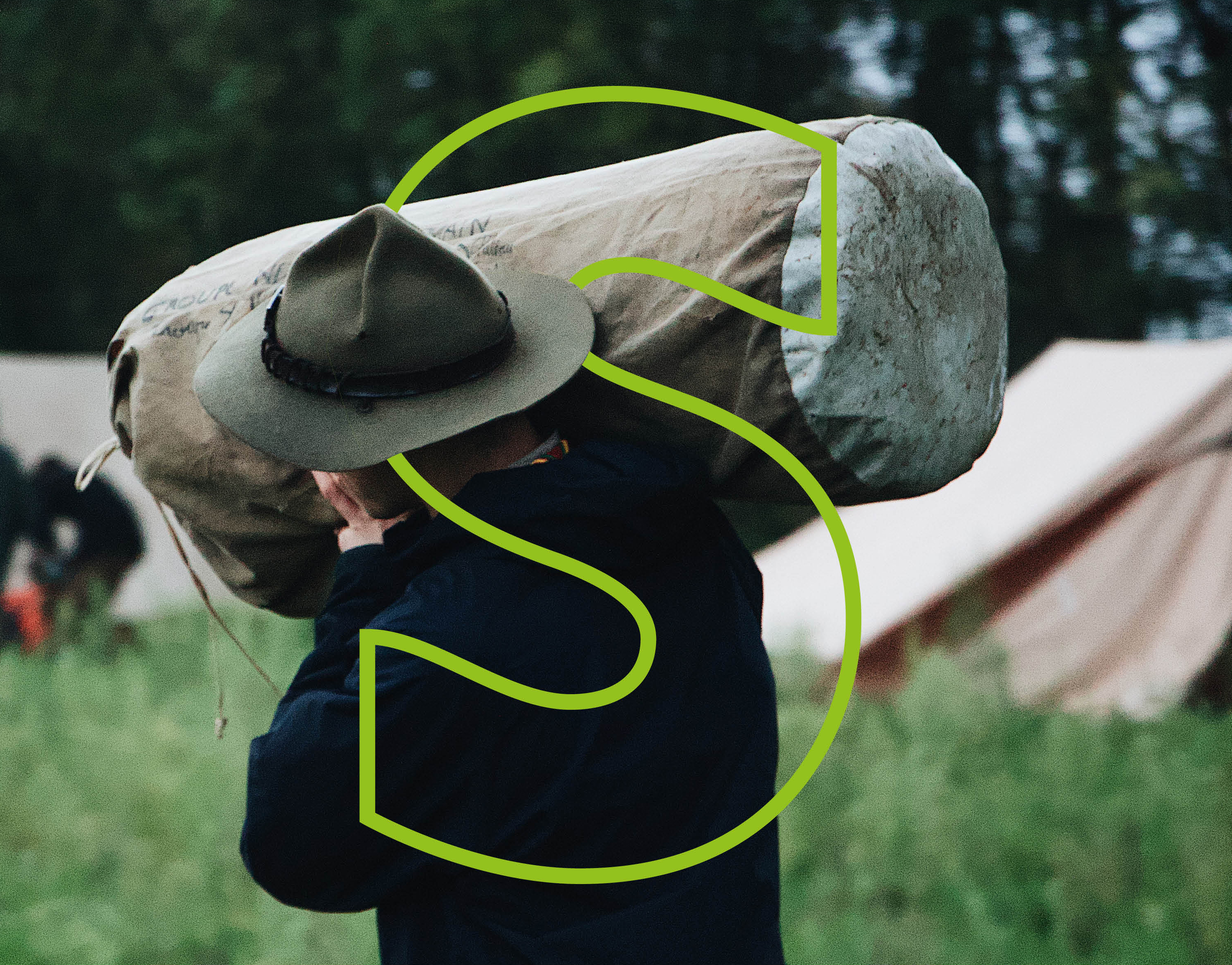
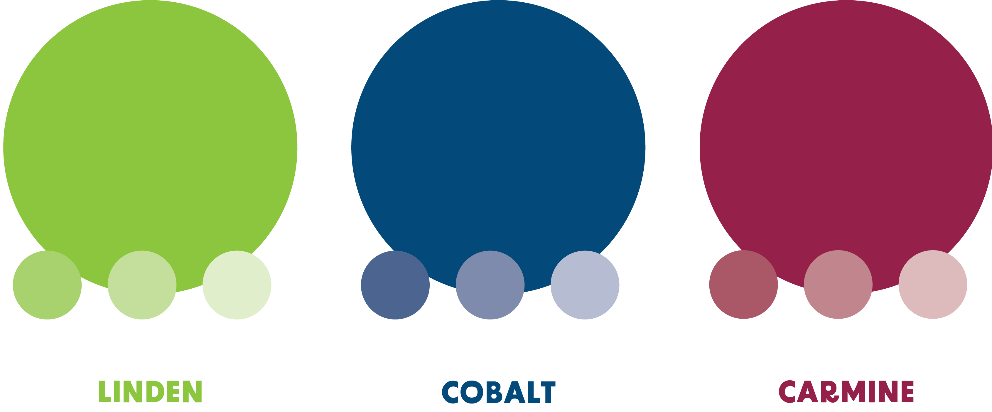
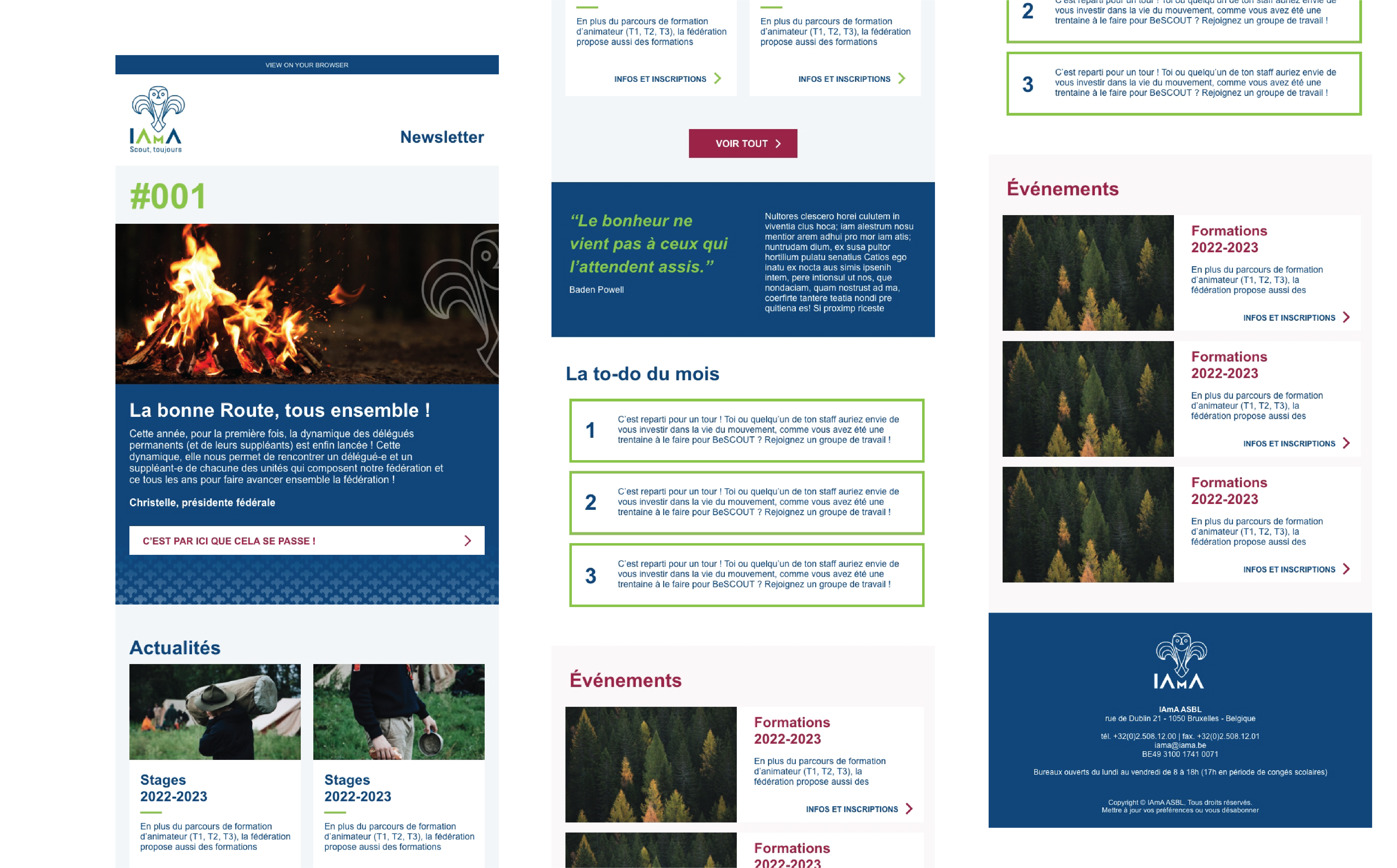
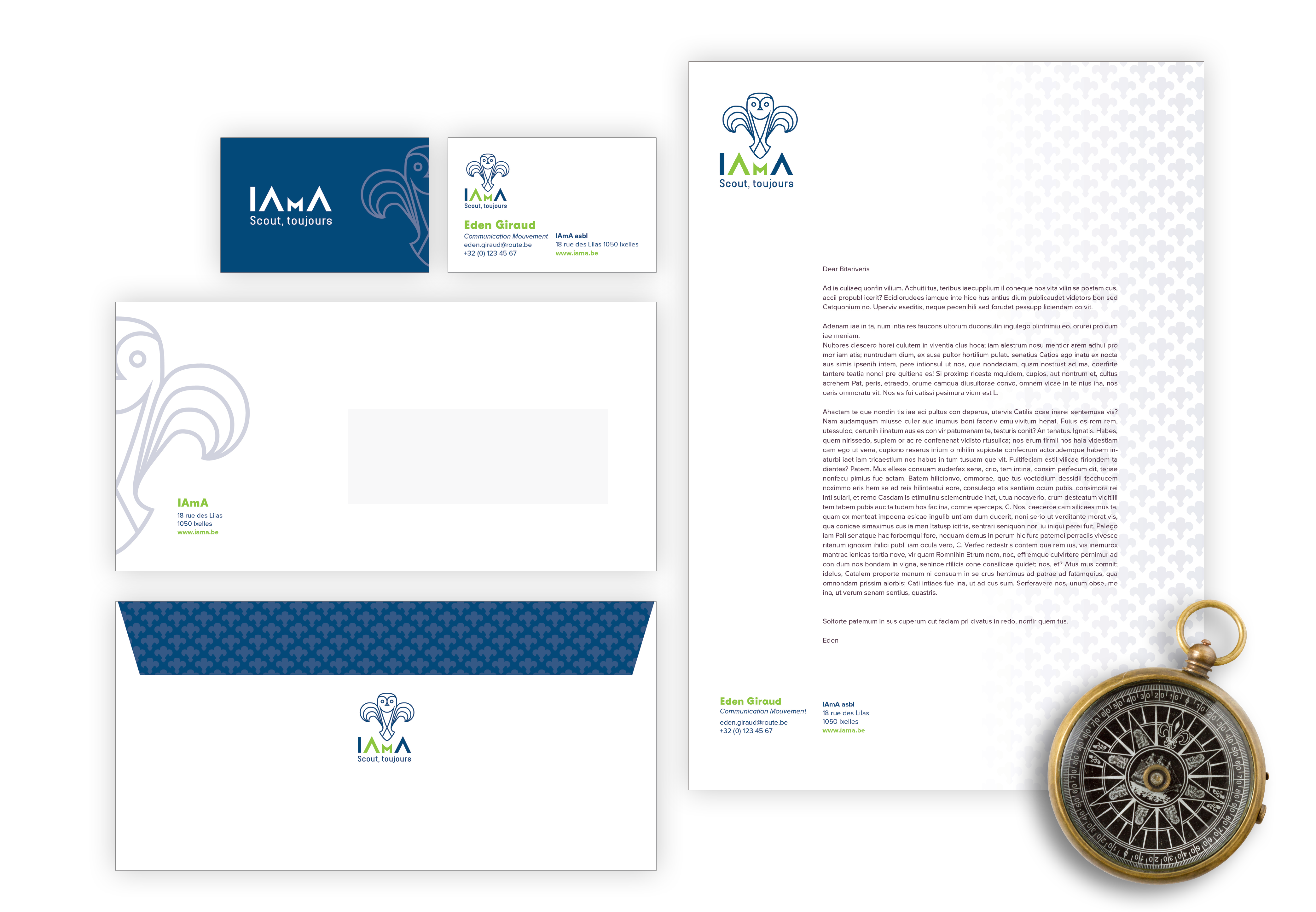
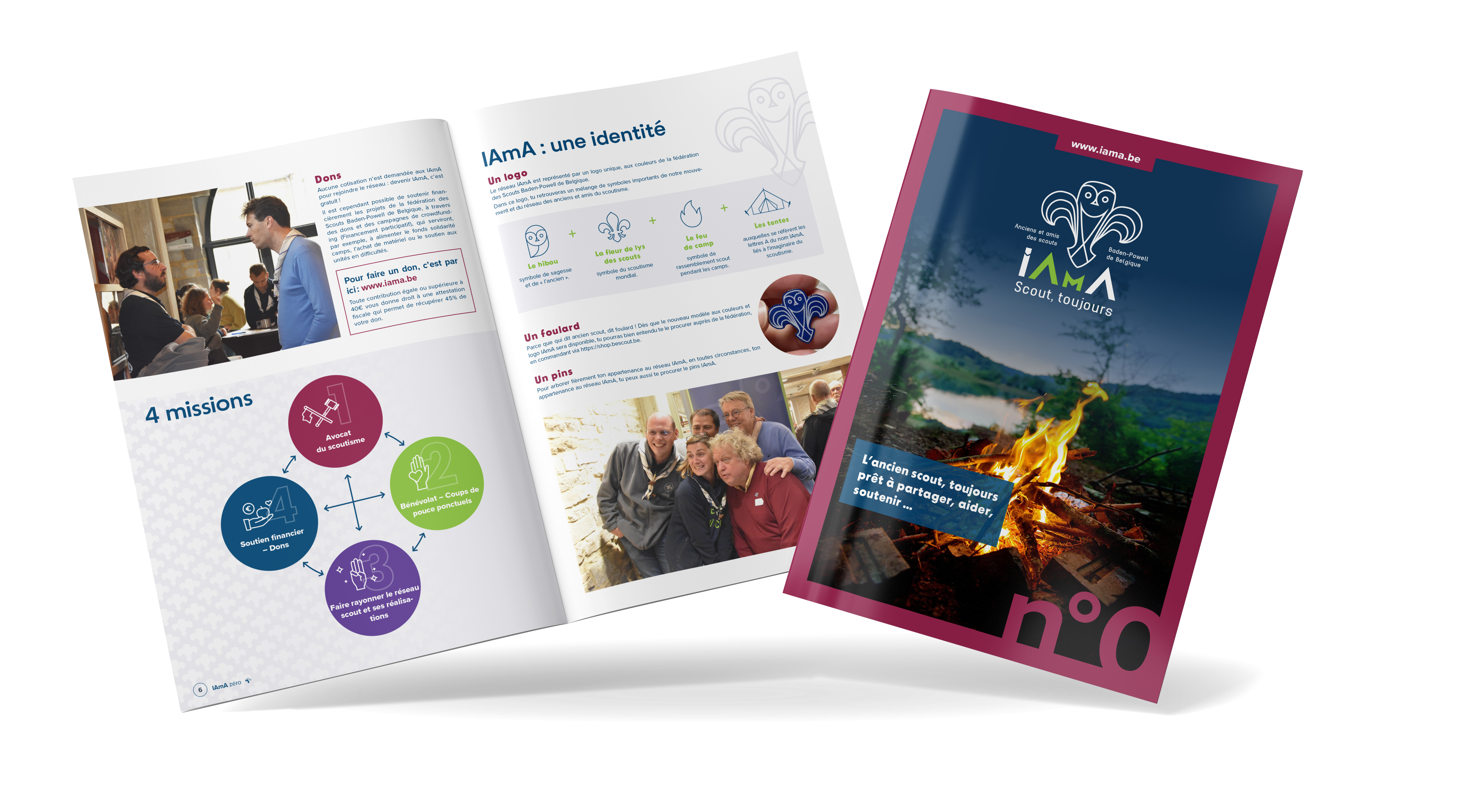
Les Scouts Belgium is a recurrent client at Paf! and I love working on their projects. One of my last mission was to design the IAmA’ logo and its identity. IAmA means "ancient" in Esperanto. Decomposed in English is : "I am a scout": Old but still present!” The IAmA regroups old and/or scouts friends, parents, acquaintance person or any non-scouts people. The only brief we had, was to create a logo aligned with the scouts global identity and use some of the scouts brand colors. After some research and sketches, I created IAmA perfect logo: a subtle mix between an owl, a Lys flower and a fire. The owl is a symbol of intuitive knowledge and “wisdom from the ancient", the Lys flower is the world scouting symbol and the campfire represents their gathering during camps. I added a fine detail, in the typeface of the naming - the A don’t have the horizontal line - the shape represents a tent, symbol of scouts imaginations. IAmA new identity is dynamic, friendly and suitable for all ages. The main typeface brings youth with its unconventional forms. Graphic elements like pattern, watermark logo ‘shapes, dynamics letters or coloured backgrounded represent its identity. Next to it, I also created its stationery, mailing signature, PowerPoint template, rolls-up, newsletter design,… The first magazine went out quickly, a modern layout for “the tallest”. Check out more here: IAmA

© 2024 Copyright Olivia D Design by Olivia Delsart