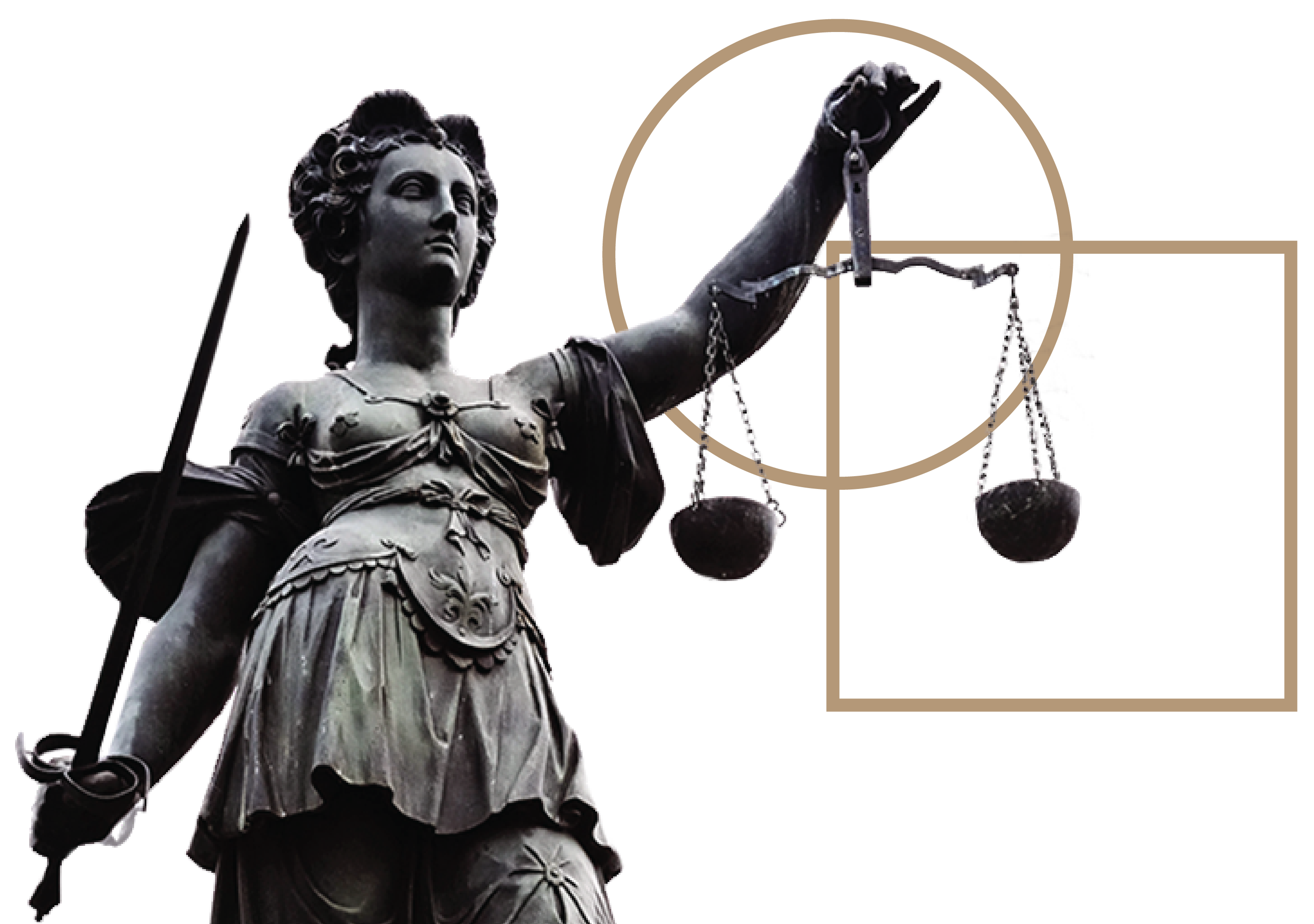
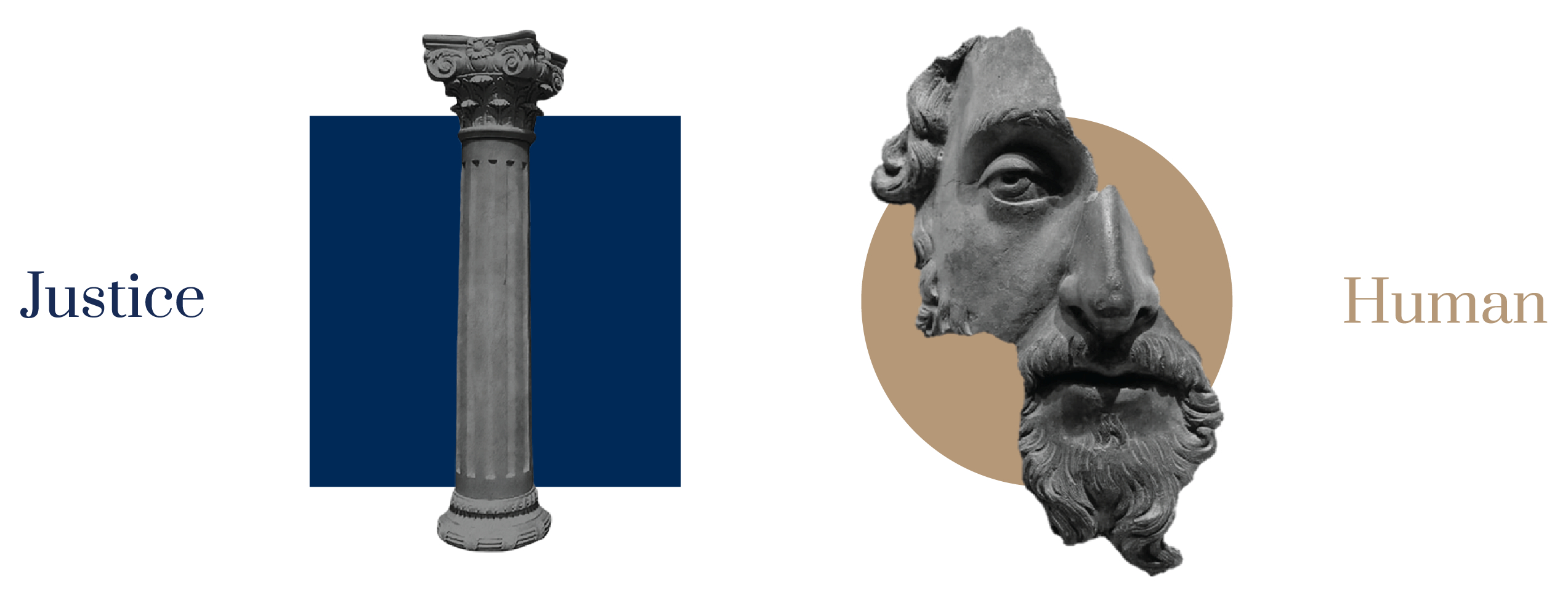
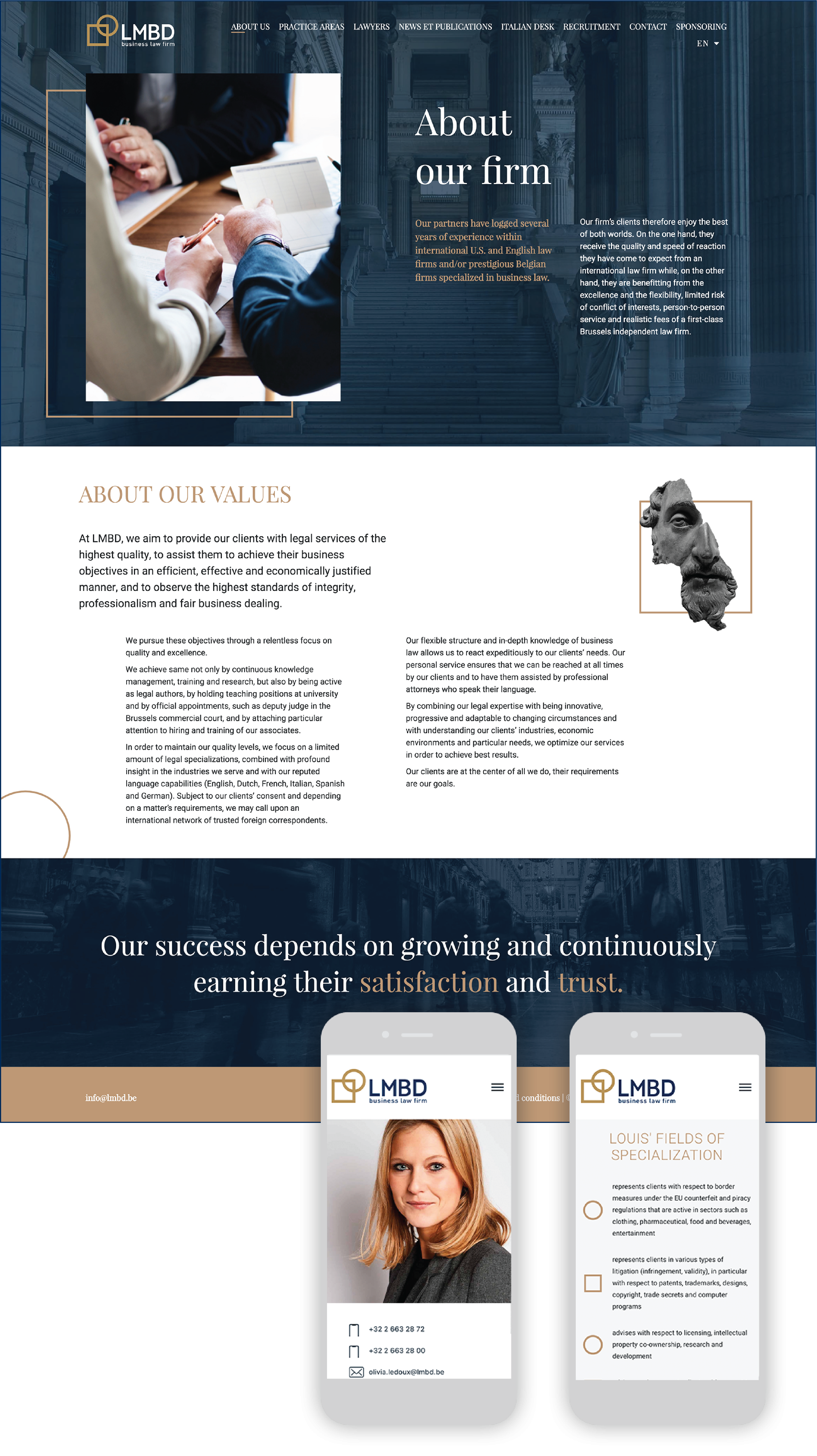
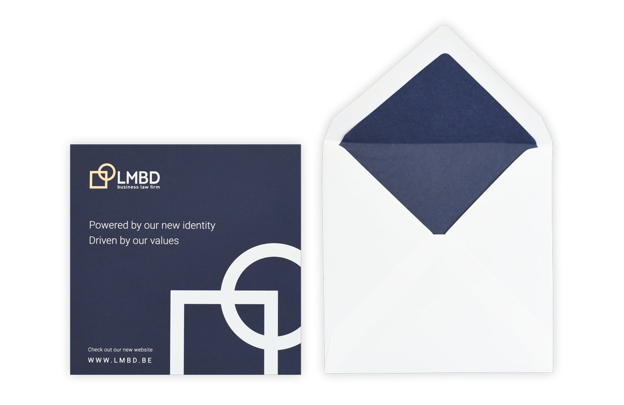
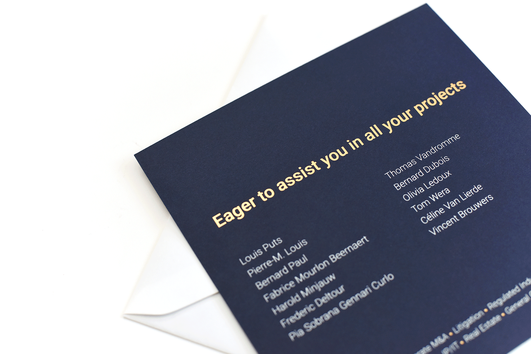
LMBD is a well-known Belgian law firm that desired a new brand identity. What an exciting challenge! LMBD is a leading Belgian law firm located in Brussels that needed a brand-new identity. Our task was to modernize and renew their look & feel within creating a new logo. An exigent assignment for a particular sector. After some meetings we agreed on creating a unique, pure and simple logo but easily recognisable. Many explorations and sketches further, I created the LMBD logo using two overlapping geometric simple - but very symbolics - shapes. The circle is the feminine side of it, organic and gentle, it represents the humankind social side of the law. It is about protection and positive change. The square is the masculine side of it, reflect more the rigid, complex and ordered part of the law, along with method and codes. It is about rules, balance and accuracy. The new identity is pure, modern but traditional. Navy blue is the primary colour, representing the rigour, the tradition and the strength of LMBD - in combination with copper colour, meant for renown and power (energy). The perfect typography combination tells the same story: a nice cocktail between modern and tradition. When we think about justice, we directly think about Divinity of ancient’s mythology! The storytelling you create around a company is also very important. For LMBD, we added some Greek mythology figures - to refer to the ancient story of the justice - bonded with the logo geometric shapes. A perfect union (again) between the modern and the traditional You could spot different Greek mythology figures in the brand-new website: www.lmbd.be. To introduce they brand-new identity to their client, we created a nice new year card 2019 with coper and white ink on a nice, texturized tick blue paper. The identity goes with a full guideline.
© 2024 Copyright Olivia D Design by Olivia Delsart